Character Evolution Research

06:23 Beth Monaghan 0 Comments

Final Fantasy Moogle Character evolution
The Final Fantasy character Moogle first appeared in the Final Fantasy games in 1990. The character started out as a white cat like character in Final Fantasy 3. 
 In later Gameboy spin offs they are shown as rabbit like characters.  The colours they used for the Gameboy spin off were more based around earthy colours like green, brown and orange.  In the most current games they are much more like the original design but there are small changes like the latest moogle has a cleaner finish, also some of the colours have been altered like the colours of the wings. The floating circle above the characters head was changed to a pink crystal.


Kirby Character Evolution
The character Kirby appeared in its first game in 1992. The character started of as a basic black and white outline. After the first game the character what coloured in pink. Through out the games Kirby’s colour changed between white, bright pink and light pink. The latest Kirby design kind of relates back to the original outline design of Kirby. In this design Kirby just has a pink outline and the rest of the character is transparent. Some of the designs have black outlining the character but others don’t. The latest designs of Kirby are very simplistic much like the original designs. Other later designs are also 3D.


 Wario Character Evolution
Wario first appeared in a game in 1992 as an antagonist. The first design of Wario is just a basic black outline of the character. The first few designs are like this but have small differences between each one like the size of the character and slight changes in assets like his nose and hat. The character is designed in 3D but in the next design the style of the design looks more hand drawn and 2D. Also the colour scheme changes from yellow and purple to blue and purple with small yellow accents. The latest design of Wario is the new colour scheme but Wario is more 3D.


Mickey Mouse Character Evolution
Mickey Mouse’s first appearance was in Steamboat Willie in 1928. The first design of Mickey Mouse is a basic black and white character. The next design of Mickey looks pretty different to the original, the shape of the characters face is more round, nose is a different shape and all the clothes have been changed. Once colour was added to the character there was little changes between designs. The only changes were the size of facial features. Then the character’s colour palette changed from red and yellow to blue and yellow. After a few designs like this the colour palette returned to the original colours. The newest design of Mickey Mouse looks like one of the 1930s designs but in colour. The newest designs are much simpler.


Lara Croft Character Evolution
Lara Croft’s first appearance in a game was in 1996. The first design of Lara Croft is very pixelated. All the shapes used in the original are very pointy and square like. As the designs progress the shapes become more curved. Through out the earlier designs there are small differences between them like slight differences in facial features, colour and clothing. The last few designs look much more realistic especially the most recent. The designs include more realistic facial features and big differences in clothing. I think the latest design of the character uses colour and appearance better than the previous designs because they can be associated with the character’s surroundings and the games concept much better.


0 comments:

Character Timeline Final Piece

05:38 Beth Monaghan 0 Comments


Timeline finished from Fairly Odd Animation on Vimeo.

For this assignment we had to create 7 characters that link with different eras/decades. For my characters I chose to create characters that matches some of the animation style trend in that year but also apply popular fashion trends to the characters. Each character's colour scheme matches their respective decades popular colours. I used Photoshop, Illustrator and After Effects to complete this assignment.

To create the 20s character I based the it off the style of the Fleischer Studios animations. During the 20s the animations created by the Fleischer brothers were very popular. Some of the main features are their characters have black eyes with a triangle cut out of them, the characters are mainly in black and white and a lot of them wear gloves. I also looked at the trends that were most popular in the 20s, these included short waved hair and embellished knee length dresses.

To create the 50s character I looked at popular animation around this time and pulled features from them to add to my character. The animations in the 50s had bright colours so I looked at the 50s colour trends and used some of them in my character. I looked at the fashion trends for the 50s and one of the most well known ones is the Poodle Skirt. I chose to feature this in the character by creating a poodle wearing a poodle skirt.

To create the 70s character I looked at colour trends during this time and then used them in the character's clothes. The main colours were different shades of orange and green. I also looked at popular animations created in the 70s and then used some of the features from the characters in my character. These features include big round eyes and circular head shapes. I added some of the popular fashion trends to my character this included flare trousers, afros and heeled boots.

To create the 80s character

0 comments:

Good and Evil final piece

05:27 Beth Monaghan 0 Comments


Good and Evil Scene from Fairly Odd Animation on Vimeo.

This is my final piece for this assignment. I chose to create a scene that had both good and evil environments. The main colour scheme was purple nut the type of purple depended on whether it was part of the good or the evil environment. I used a light purple for the good environment and dark purple for the evil environment. I used Photoshop, After Effects and Premiere Pro to create this. A lot of my images where photos I had taken but images like the castles I took off the internet and altered them to fit the environment.

0 comments:

Tracking test

01:07 Beth Monaghan 0 Comments


Tracking test 2 from Fairly Odd Animation on Vimeo.

This was my first try at tracking images to a piece of footage. We did this on After Effects and Mocha. I found the process fairly easy to pick up, it is a useful skill and I will continue to use it throughout my work.

0 comments:

Animation Inspiration

03:59 Beth Monaghan 0 Comments

The Wanderer from The Animation Workshop on Vimeo.
This animation was created by a group of third year character animation students in Denmark. The animation is about a character called 'The Wanderer' who goes through his entire life in one day and then dies at the end. I love the style of this animation, the colours all compliment each other and the story is very interesting. All of the animation's backgrounds look realistic because of the use of textures.


Memory Stream from Yeojin Shin on Vimeo.
This animation was created by Yeojin Shin. The animation's concept is that the animation explores the idea of how we as human beings store memories and experiences in a digital space and how we access the memories from the past. I think this animation is very unique and has a very distinctive style. The colours are very vibrant, this creates an image that is very pleasing to the eye.


小さな庭園 / Small Garden from Shunsuke Saito on Vimeo.
This animation was created by Shunsuke Saito. This animation's story is about a life form that wakes up in a mysterious world as he spends more and more time there he starts to understand what kind of place it is. This animation also has very vibrant colours, this exaggerated the beauty of the world the life form had woken up in. It also has a very obvious dream-like style.

0 comments:

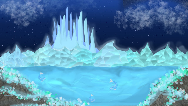
Crystal City

15:37 Beth Monaghan 0 Comments


0 comments:

Local Animation Company Research

15:08 Beth Monaghan 0 Comments


Arcus Studios

Arcus studios are a 2D animation studio that creates Animation, promotional videos and video installations. Some of their clients include companies like CBBC and E4. Arcus Studios’ style is very bright and has a very distinct cartoon look. Arcus studios created a series of animations for CBBC, These animations feature CBBC’s mascots. The company also created an estings for the E4 Estings competition. The company’s logo is very bold and is distinctive, it is an orange airship. The colour of the logo matches the website’s black, white and orange colour scheme. The artists in this company include Alex Davey, Greg Fraser and others.


Kuro Dragon Studios

Kuro Dragon Studios is one of the leading 3D animation studios in the UK. Some of their clients include ITV, Northumbria University and University of Hull. The company's logo is made up of the company's name written in a font that matches the company's style. Some of the company's work has a very realistic style but other pieces of their work have a very cartoony look. This shows they can be versatile. The company also create technical visualisations for the oil, gas and renewable energy sector. These visualisations are used at exhibitions and events. They demonstrate how complex products and services work.


Bloom Studio

Bloom Studio is an animation company that specialises in film, TV and web. Their work is a collaboration of computer graphics, film and fine art. Bloom Studio has previously created an ident for sky arts, an animation for Oxfam at Leeds festival. The companies’ logo is very simplistic and uses a very clean colour scheme. Sometimes the logo can be found in orange, rather than the usual white logo. The company’s style can be fairly cartoony but other pieces of their work hold a realistic style.

0 comments:

Prey Stop Motion

06:53 Beth Monaghan 0 Comments


Bird Final 1 (Converted) from Fairly Odd Animation on Vimeo.

This is the stop motion i created for our stop motion assignment. To create this animation i cut out birds from card to create bird silhouettes. Once all of the birds were cut out i shone a light through the   cut outs and on to a wall. Once i finished taking the picture i edited the video on After Effects, i overlaid colourful images onto the video to create different coloured birds. The colour of the backgrounds changed to suit the mood of the video. i chose to do this as an animation because i thought it was quite an unusual technique. I had cut out around 300 frames

0 comments:

Characterpilla

05:52 Beth Monaghan 0 Comments


Characterpilla_001 from Characterpilla on Vimeo.

Characterpilla was a project that my course took part in. The project was submitted into a college wide competition called 'The Diversity Awards". Our aim was to make a walk cycle that consisted of as many drawn characters as possible. All the different characters would represent the image of diversity. Anyone was able to contribute by drawing their own characters and submitting them. The characters could be submitted as hand drawing, digital drawing, paintings or any other kind of art form. We received submissions from all across the globe.

0 comments:

Mountain Landscape

08:40 Beth Monaghan 0 Comments


I created this landscape as a background for one of the frames i used in my motion comic. My motion comic was based on the H.P Lovecraft short story, Till A' the Seas.

0 comments: